AI Checker
Plagiarism Checker
Grammar Checker
Content Quality
Guideline Checker
Readability Checker
Fact Checker

Chrome Extension

There is some debate about the difference between serif vs sans serif readability. Some argue that sans serif is the more readable choice, while others say that it doesn’t matter. So, what’s the deal, here? Should you always go with a sans serif font to improve readability? Or will a serif option work just as well?
In this article, we’re going to explore serif vs sans serif readability. We’ll talk about the features of each option, the differences between them, and how the font you choose can affect readability. We’ll also give you some advice on which font you should use for the best, most readable content.
Have you ever noticed that fonts like Times New Roman have extra little lines at the ends of each letter? For example:
This is a Times New Roman font.
You can really notice it at the bottom of the capital “T”. These little strokes are called serifs, and they are the main distinguishing feature of serif fonts. They tend to have a more traditional, conservative look than their sans-serif counterparts.
Serif fonts aren’t all the same, though. Here are the four main serif typeface families and an example of each:
As you can see, they all have those characteristic serifs.
“Sans” is the French word for “without”. So, sans serifs means “without serifs”. The lack of flourishes or other decorative elements gives sans serif fonts a modern, minimalist look.
Sans serif fonts are also divided into four typeface families:
You only get clear, clean lines with sans serif fonts.
By now, there’s a good chance that you’ve noticed the main difference between serif and sans serif fonts: the serifs. But while those extra little lines give serif fonts a more formal, traditional look than sans serif ones, the question remains: do they affect readability?
Before we get to the big question, let’s make sure we’re on the same page about what readability is. In a nutshell, readability refers to how easy it is to read a given text. So, if something has high readability, it’s easy to read. And if it has low readability, it’s difficult to read.
While there are several factors that can affect the readability of your content, the font you choose can play a major role. After all, readers need to be able to see your letters, words, and sentences to read them properly. So, if you want to create readable content, you need to use a clear, legible font.
Since they have cleaner lines, many people may think that sans serif fonts are better for readability. But according to research, serifs themselves don’t make a significant difference in the legibility of content.
That’s not to say that they don’t affect readability at all, though. The same study found that serifs are slightly more legible when it comes to reading small or distant text. Some people also say that they can also make it easier to read printed materials, as serifs help the eye follow along lines of text.
But what if you’re writing online content, where text size and print aren’t an issue? Well, sans serif options are a popular choice. They tend to be easier to read on various device screens, as the lack of serifs makes each letter sharper and clearer.
So, which should you choose? Well, if you go with popular opinion, then serif fonts are best for printed materials like newspapers and magazines. They’re also a good choice when the text that is small and/or needs to be read at a distance.
Sans serif fonts, on the other hand, are often ideal for online materials. So, you may be able to improve the readability of blog posts, online articles, and web pages by using a sans serif font.
While research suggests that there is little to no difference between serif vs sans serif readability, there are a few factors to consider when choosing between the two. Serif fonts are usually the go-to choice to improve the readability of print materials and small, distant text. But if you want to make online reading easier for your audience, then you may want to go with a sans serif option.
Ultimately, though, there’s a lot more that goes into readability than font choice alone. So, if you really want to make your content more readable, then you should use a readability checker.
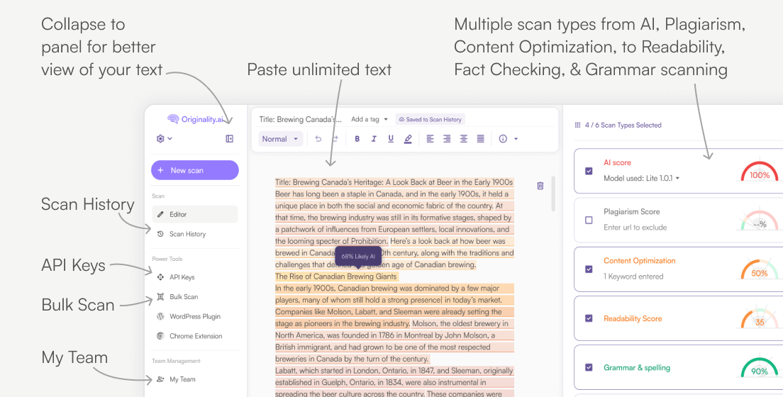
Originality.AI’s readability checker will analyze your text, highlight opportunities for improvement, and calculate your scores on the most reliable readability tests around. You can then use this information to improve the readability of your content.
With the right font choice and a readability checker on your side, you’ll be creating clearer, more concise content in no time. Good luck!
Get insight into the reading age of political speeches. Find out which candidates use the lowest reading age, which ones alter the reading age based on where their speech is, and how political speeches have changed in recent times.
For those of you busying yourselves creating a business presentation, you might find using Google Slides the best method. Created by Google, this preferred presentation tool provides its users with a vast collection of excellent features to make sure presentations are engaging. In fact, this is the most popular presentation tool available.

AI & Plagiarism Detector for Serious Content Publishers
Originality.ai
64 Hurontario St
Collingwood, Ontario
L9Y 2L6